Appearance Tab: Login Form
Overview
The login form settings in the Appearance tab provide customization options for the appearance and functionality of the user login form on your website. To access these options, navigate to: WP Admin > Ultimate Member > Settings > Appearance > Login Form

Login Form-Specific Settings Priority
Ultimate Member allows you to configure appearance settings individually for each Login Form. When settings are defined at the login form level, they take the highest priority over global login form appearance settings. This means that if you customize the appearance within a specific login form, those settings will override the global login form settings applied site-wide.You can configure these settings in WP Admin > Ultimate Member > Forms by editing the desired Login Form and adjusting the appearance options accordingly.
Template
To keep your custom login templates compatible with plugin updates, you can place them in a child theme. This makes them available in the Template dropdown when customizing login forms. You can learn more here: Adding Your Custom Profile Templates.
This section allows you to customize the user login template and size, including the default template for login and the maximum width of the login form shortcode. The shortcode alignment can also be specified in this setting. This part of the settings pertains to customizing the appearance and layout of the user login form:
Login Default Template
This setting allows you to choose the default template used for the user login form. Templates control the overall design and structure of the form, such as the arrangement of fields and the styling.
Login Maximum Width
Specifies the maximum width that the login form shortcode can occupy on the page. This helps to ensure that the form is displayed correctly and is not overly wide, especially on devices with smaller screens. The default login maximum width is 450px.
Login Shortcode Alignment
Determines the alignment of the login form shortcode within its container on the page. For example, setting it to "Centered" will align the form in the center of the container. Alternatively, you can choose left or right alignment. This can be useful for ensuring the form is visually balanced with other elements on the page.

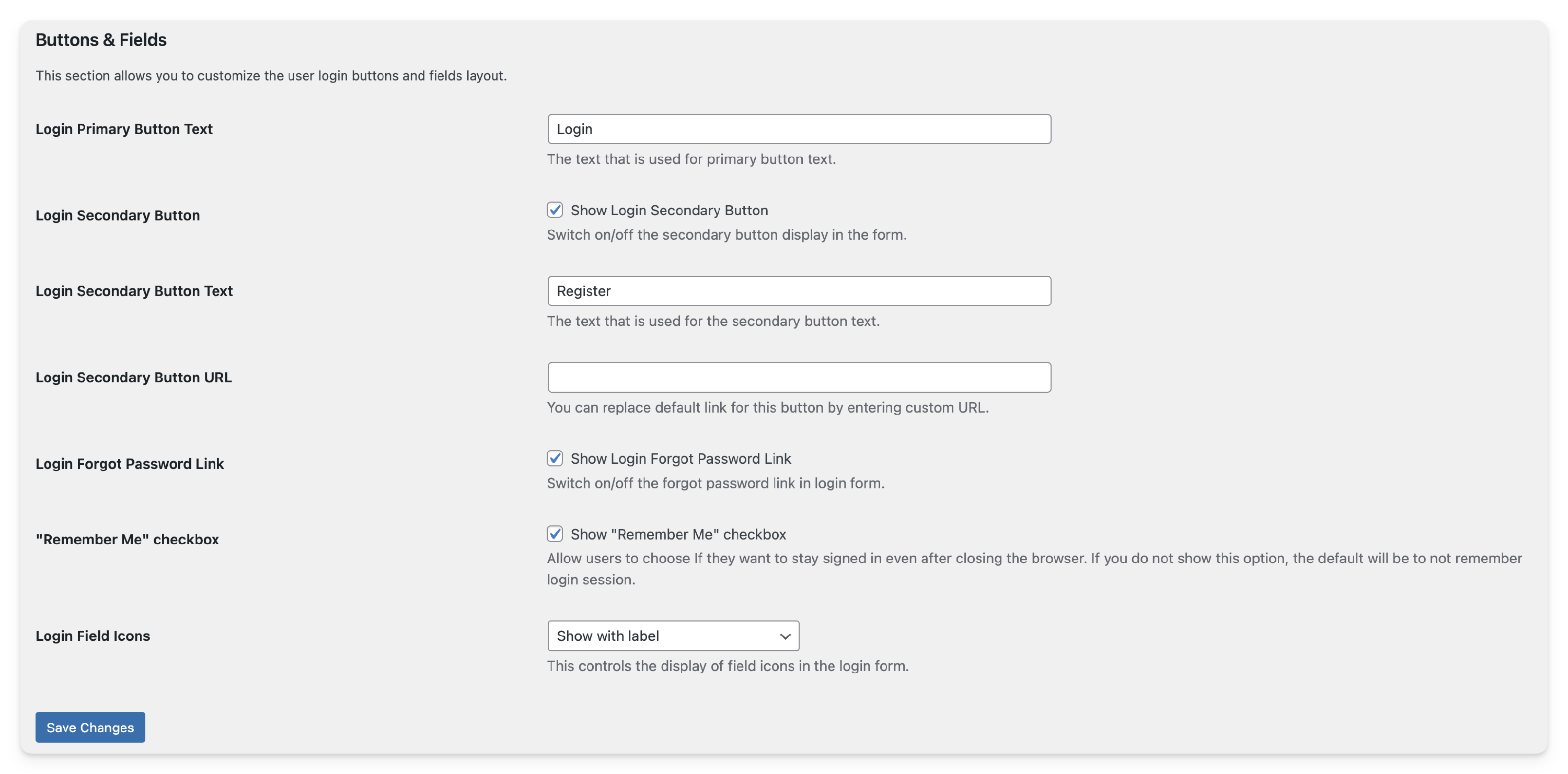
Buttons & Fields
This section allows you to customize the user login buttons and field layout. You can set the text for the primary login button, control the display of a secondary button (e.g., for registering), and customize the text and URL for the secondary button. The option to display a "Forgot Password" link and a "Remember Me" checkbox can also be toggled on or off. Additionally, you can control the display of field icons in the login form, choosing to show them with labels for better user understanding. These settings offer flexibility in designing a user-friendly login form that meets your website's requirements.
Login Primary Button Text
This setting allows you to specify the text that appears on the primary button of the login form, typically used for actions like submitting the form with the login information. The default text is "Login."
Login Secondary Button
This setting lets you control whether a secondary button is displayed on the login form. This button can be used for additional actions, such as registering for a new account.
- Login Secondary Button Text: If the secondary button is enabled, this setting allows you to specify the text that appears on the secondary button, such as "Register."
- Login Secondary Button URL: If the secondary button is enabled, you can customize the URL that the button links to, allowing you to redirect users to a specific page when they click the button.
Login Forgot Password Link
This setting allows you to toggle the display of a "Forgot Password" link on the login form, which users can use to reset their passwords.
"Remember Me" Checkbox
This setting enables or disables the "Remember Me" checkbox on the login form, allowing users to choose whether they want to stay signed in even after closing the browser.
Login Field Icons
This setting controls the display of icons next to the fields in the login form. You can choose to show the icons with the following options which can help users understand the purpose of each field.:
- Show with label: Icons are displayed alongside the field labels, providing a visual cue next to each field description.
- Show inside text field: Icons are placed inside the text fields themselves, usually as placeholder text or background icons.
- Turn off: Icons are not displayed next to the fields, providing a more streamlined form layout without visual cues.
Deprecated Articles: Due to recent updates in Ultimate Member, older articles have been moved to the Deprecated category and may no longer be relevant. However, they remain available for historical reference.
For the previous version of the Appearance Tab documentation, you can view the old article here. Please note that it may contain outdated information that has since been updated.