Field Types Setting
Overview
This article will provide instructions and information about the field type settings. When setting up a new field or editing a field, you can set certain things like field title, privacy, etc. The common settings of a field are the following:
- Title - This will be the title of your field in the backend for reference. This will not appear on your site.


- Label - This is the label of your field. Text entered in this label settings will appear on your site. If you do not want a label above your field, leave the Label setting field blank.


- Meta Key - This setting must store info entered in the field in the database. The meta key should be unique. It can only be written in lower case. Use underscore ( _ ) to separate words. e.g country_list, job_title.
You can't change or edit the meta key of an existing field or when you have selected predefined fields. Meta keys cannot be duplicated. You need to create a new field if you require a new meta key.
- Placeholder - The text entered in this setting will be the text that appears within your field on your site.


- Help Text - This setting will provide helpful instructions to your users. The text entered in the help text settings will appear when a user hovers on the field tooltip icon.


- Privacy - This setting allows you to select who can view the field on your site. Admin can view all fields regardless of the option set here. You can choose the options below when you click on the dropdown menu:
- Everyone - This option makes your field public; everyone can view the field.
- Member - If this option is selected, only members of your site can view the field.
- Only visible to profile owner and users who can edit other member accounts - If this option is selected, only the owner and editors can view the field.
- Only visible to profile owner and specific roles - If this option is selected, the owner and the chosen roles can only view the field.
- Only specific member roles - If this option is selected, the roles specified in the settings will be the ones who can only view the field.

- Default Value - This option allows you to prefill a field with a default value before the user enters a value in a field. If you want to have no default value, leave the setting blank.

- Validate - You can select from this option if you require a field to have a unique validation.

- Visibility - This setting will allow you to select where the field should appear. To know more about the field's visibility, you can read the Fields Visibility Mode documentation here.

- Is this field required? - Check the box in this setting if you require a user to fill in the field before processing the form.

- Can user edit this field? - Check the box in this setting if you want to allow users to edit the field. Admin can edit all fields regardless of the option set here.

- Icon - You can choose from 1283 available icons in this setting to display on your site. You can leave this setting blank if you prefer not to display an icon.

- Add conditional fields support - You can show or hide the field in this setting using conditional logic based on a specific field's value or condition. To know more about conditional logic, you can read the document here.


Some fields may include additional settings, it will be discussed below:
Text box field settings
- Minimum & Maximum length - You can set the minimum or a maximum number of characters that can be input in the field. To disable these settings, leave it blank or empty.
 Number field settings
 Number field settings
- Minimum & Maximum number - You can set the minimum or a maximum number that can be input in the field.

Textarea field settings
- Textarea Height - You can set the height of the textarea in this setting. The default is 100 pixels.
- Maximum length - You can set the maximum number of characters input into the field. To disable these settings, leave it blank or empty.
- Maximum allowed words -You can set the maximum number of words that can be input in the field. To disable these settings, leave it blank or empty.
- Default Text - Set the text default text to be displayed in the field.
- Does this textarea accept HTML? - You can enable or disable the HTML tags for this field.

Dropdown field settings
- Choices Callback - To retrieve choices, you need to add a callback source in this setting.
- Edit Choices - You can set the available choices here for the users. You need to enter the options per line.
- Parent option - You can populate the option depending on the parent option selected.

Multi-select field settings
- Minimum & Maximum number of selections - Set the minimum or the maximum number of selections a user can pick.
- Edit Choices - You can enter the choices users can select in this setting.
- Choices Callback - To retrieve choices, you need to add a callback source in this setting.

Radio field settings
- Edit Choices - You can enter the choices users can select in this setting.

Checkbox field settings
- Maximum number of selections - You can set the minimum or the maximum number of selections a user can pick.
- Edit Choices - You can enter the choices that users can select in this setting.
 URL field settings
 URL field settings
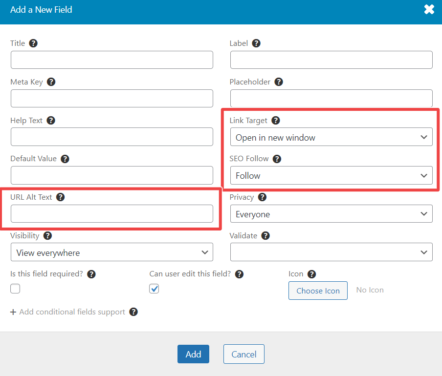
Password field settings
- Minimum & Maximum length - Set the minimum or a maximum number of characters to be inputted in this field.
- Force strong password? - This setting is only applicable in the register form. If enabled, users will be forced to enter a strong password consisting of at least one lower case letter, one upper case letter, and a number.
- Automatically add a confirm password field - If enabled, a confirmed password field will be added below the password field. This setting only applies in the register form.
- Confirm password field label - Set the label above the confirm password field, leave the field empty to use the default label.

Image Upload field settings
- Allowed Image Types - You can select what image type users can upload in this field. Choose from PNG, JPEG, JPG, & GIF. To select multiple image types, you can press ctrl or command and click on your preferred image types or click and drag the image types.
- Maximum size in bytes - You can set the maximum size of the image a user can upload in this field. Leave this setting empty to have unlimited size.
- Crop Feature - You can enable or disable the crop feature of the image upload and define the ratio. When you click from the drop the menu of the Crop Feature setting, you can select from the following:
- Turn Off - This is the default setting of the crop feature. It means that the crop feature is disabled.
- Crop and force 1:1 ratio - When selected, the user is forced to crop the image in a 1:1 ratio.
- Crop and for user-defined ratio -The user is forced to crop the image accordingly when selected.
- Upload Box Text - Text entered in this setting will be the headline that will appear in the upload box for this field.
- Additional Instructions Text- Text entered in this setting will appear below the headline. This is for further instructions.
- Upload Box Text (Button) - Text entered in this setting will appear in the button. e.g., upload


File Upload Settings
- Allowed File Types - You can select the file types your users can upload in this field. You can choose PDF, Text, CSV, DOC, DOCX, ODT, ODS, XLS, XLSX, ZIP, RAR, MP3, JPG, JPEG, PNG, GIF, EPS, PSD, TIF & TIFF. To select multiple file types, you can press Ctrl or Command and click on your preferred file types or click and drag the file types.
Note: Use a hook um_allowed_file_types if you need to extend allowed file types. - Maximum size in bytes - You can set the maximum size of the file a user can upload in this field. Leave this setting empty to have unlimited size.
- Upload Box Text - Text entered in this setting will be the headline that will appear in the upload box for this field.
- Additional Instructions Text- Text entered in this setting will appear below the headline. This is for other instructions.
- Upload Box Text (Button) - Text entered in this setting will appear in the button. e.g., upload


Date picker field settings
- Set Date Range - You can set the date range by:
- Fixed Number of Years - If selected, you can set the number of years the user can pick. The default to last is 50 years.

- Specific Date Range - If selected, you can manually set the minimum and maximum date/day range.

- Fixed Number of Years - If selected, you can set the number of years the user can pick. The default to last is 50 years.
- Date User-Friendly Format - You can select in this option which format of the date you want to display on your site.
- Use custom Date Format - You can customize the date format in this option. This will override the "Date User-Friendly Format" option.
- Displayed Date Format - This option allows you to show full dates or show years only.
- Disable specific weekdays - This option allows you to disable particular weekdays from the date picker.


 Time picker field settings
 Time picker field settings
Rating field settings
- Rating System - This option allows you to choose from a 5-stars or 10-stars rating system.
- Default Rating - You can set the number of stars for a prefilled rating field.


Content Block field settings
- Content Editor - This allows you to edit your content.
 Shortcode field settings
 Shortcode field settings
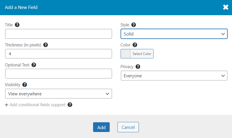
Spacing field settings
- Spacing - allows you to set the spacing in px on your form. The required spacing is 20px.


Divider field settings